
Accordion Module
Accordion Module
Lorem ipsum dolor sit amet, consectetur adipiscing elit. Mauris aliquam, ligula at varius rhoncus, purus diam vulputate ante, sit amet dignissim neque augue.
Font options available.
Font options available.
Lorem ipsum dolor sit amet, consectetur adipiscing elit. Mauris aliquam, ligula at varius rhoncus, purus diam vulputate ante, sit amet dignissim neque augue.
No font size options.
No font size options.
Lorem ipsum dolor sit amet, consectetur adipiscing elit. Mauris aliquam, ligula at varius rhoncus, purus diam vulputate ante, sit amet dignissim neque augue.
There is no "title" for this module.
There is no "title" for this module.
Lorem ipsum dolor sit amet, consectetur adipiscing elit. Mauris aliquam, ligula at varius rhoncus, purus diam vulputate ante, sit amet dignissim neque augue.
Countdown Module
Font size and padding is fixed.
Featured Products (use at least 4 tiles)


Story Feature 1
The story feature module can accommodate up to 3 tiles. Regardless of the number of tiles, it is placed horizontally and is swipe-able on mobile.

Story Feature 2
We can have the corners of the images be rounded or square. Font size can be adjusted for everything.

Story Feature 3
There are three button options. Button (in square and we can choose between square or rounded edges), standard (underlined), and bold (underlined and bold). This example uses the "bold" button.


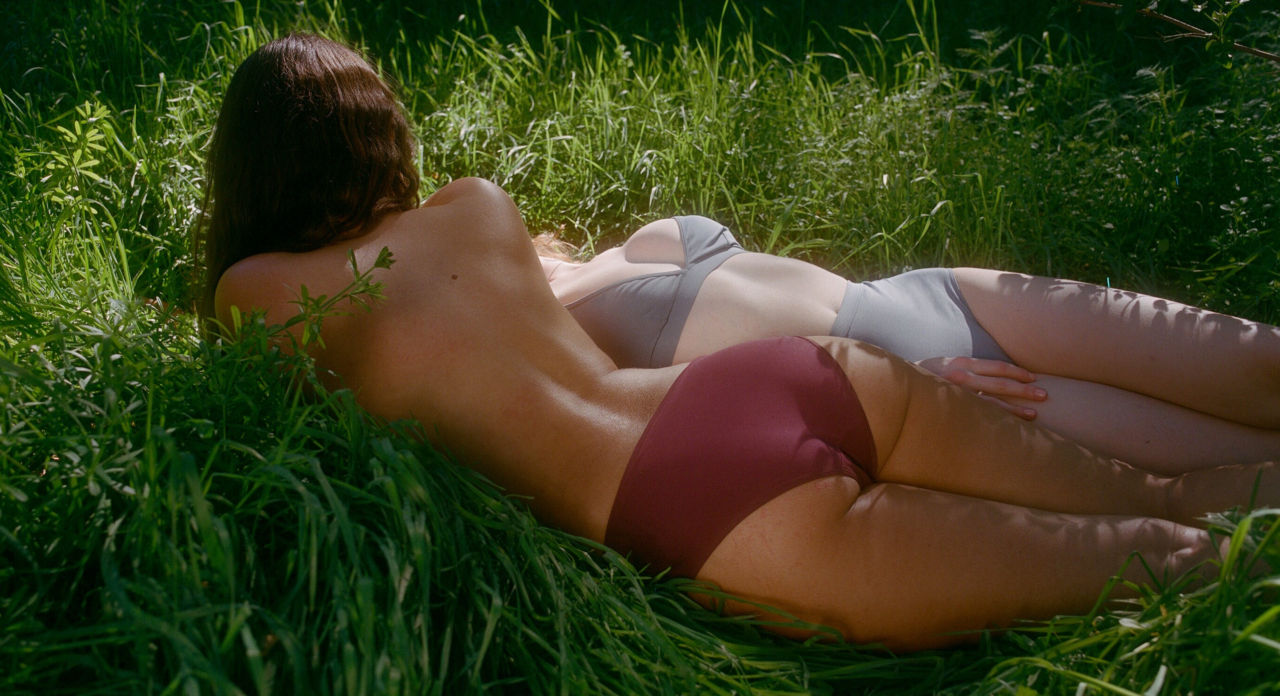
![hola]() Why ThirdLove
Why ThirdLove
 Why ThirdLove

Tile 1
Icon size adjusts based on image that is added.
Tile 2
We can add a maximum of 4 tiles to this module.
Tile 3
Lorem ipsum dolor sit amet, consectetur adipisicing elit. Earum, sit?
Tile 4
Lorem ipsum dolor sit amet, consectetur adipisicing elit. Earum, sit?
Text with CTA
Font size and alignment is adjustable for everything except button which has a fixed font size. We can also adjust the padding of this module manually and customize it as as we want. This custom padding will apply to both desktop and mobile. If we don't add in customer container padding, this is what it looks like.

Image and Text V1
Full bleed image and text module.
Separate desktop & mobile images.
All alignments, font, font size, and padding adjustable.
Image and Text V2
Content Column 1/3 Width
Image is set to column 2/3 width.
Image can be on right or left.
Can have separate desktop and mobile image.
We can adjust mobile to either have image or text on the top.
All alignments, font, font size, padding, and line height adjustable.


Image and Text V2
Content Column 1/3 Width
Images are set to column 1/3 width. We can also have image in the center, flanked by 2 columns of text. Or we can also have text in the center, flanked by 2 columns of images.
Image and Text V2
Content Column 1/2 Width
Image is set to column 1/2 width.
Image can be on right or left.
Can have separate desktop and mobile image.
We can adjust mobile to either have image or text on the top.
All alignments, font, font size, padding, and line height adjustable.

Image and Text V2
Content Column 2/3 Width
Image is set to column 1/3 width.
Image can be on right or left.
Can have separate desktop and mobile image.
We can adjust mobile to either have image or text on the top.
All alignments, font, font size, padding, and line height adjustable.
 is available over $35